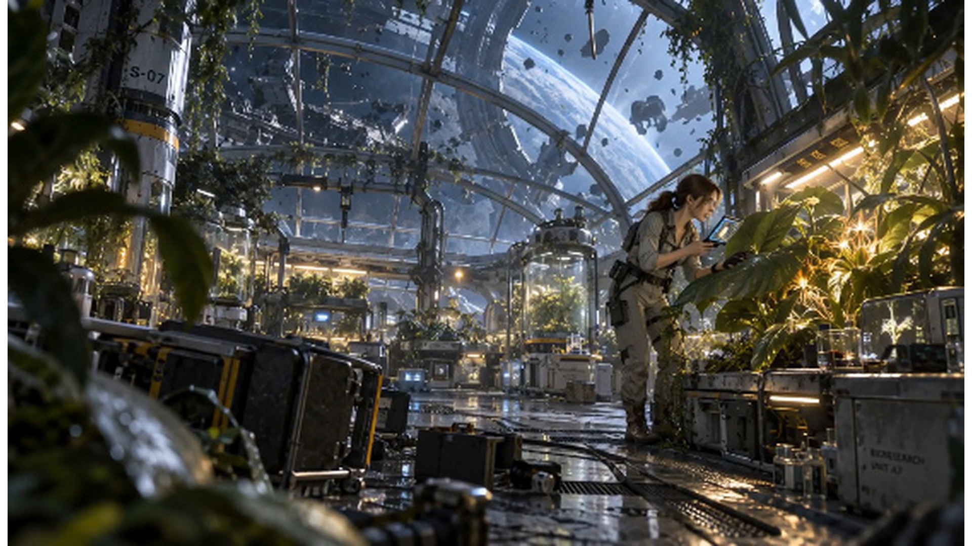
Style, Text Size, Color, and Alignment in an AI Video Generator
The text isn’t just for decoration in short-form video. It draws attention, provides context, and emphasizes key information. The size, color, alignment, spacing, and placement influence the processing of each message. While AI can produce compelling visuals, human creativity and attention to detail are still essential for fine-tuning the text. Headlines might require emphasis; captions should not obscure key images. Pippit links video generation to real-time editing of text and visuals.
Why Text Styling Matters in AI-Generated Videos
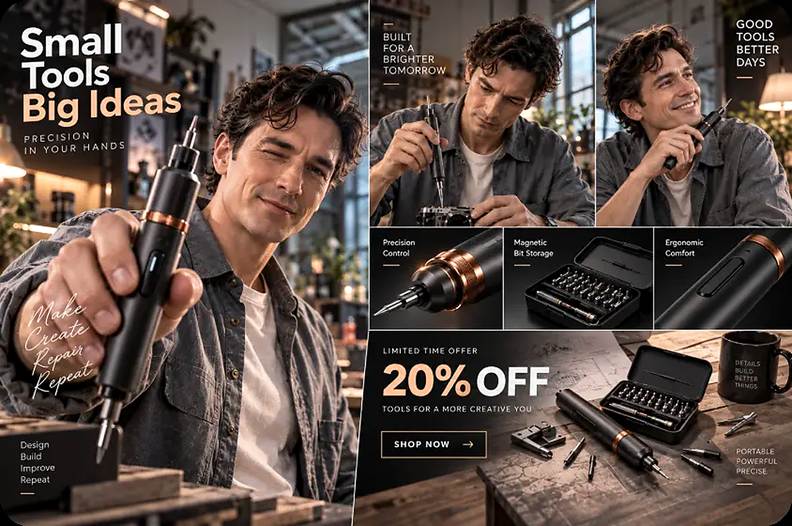
Short-form viewers take in visual information at a speedy pace, and a text hierarchy is key to communication. An opening sentence that captures the reader’s attention and sets up the main topic. Supporting copy complements the overall message without overshadowing it. Captions are a support for the spoken word and can also be used to follow content when no sound is available. Calls to action push viewers towards a particular next step. These elements can be generated by an AI video generator as part of a larger visual composition. Products, faces, demonstrations, or important details in the scene can be hidden by poor placement. The size, contrast, space, alignment, and position of the screen are factors that influence readability. Effective styling complements the message rather than making each element stand out equally.
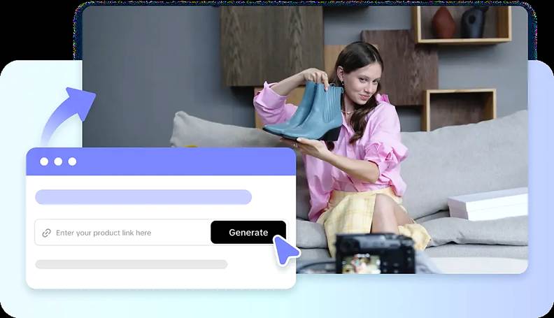
Control Text Size for Different Information Levels
Text size creates the reading order by indicating which information is the most important to read first. Large text is great for hooks, short headlines, announcements, and primary messaging. Smaller text can be used for supporting details and still be legible on mobile devices. Captions should remain large enough as viewers may view from a distance. When text overlays products, subjects, or demonstrations, too much scaling can cause issues. If the scenes are all the same size, it will be easier to distinguish them as belonging to one visual system. If you have multiple scenes, you can use the same scale for the primary headlines for greater continuity. Pippit allows for editing and tweaking of the generated text, allowing for size tweaks at the scene level. Before increasing the text size anymore, check the text with the subject.
Choose Text Colors That Support Readability and Branding
The color of text must have sufficient contrast with the background to be legible. Bright imagery or light-colored surfaces can cause light text to vanish. Dark words can become hard to see in dark shadows or dark products. Legibility should be the primary concern, but brand colours can enhance identity. Selected words or offers can be highlighted with bright colours. Too many colors can dilute hierarchy and create a disjointed visual composition. Color roles are consistent to enable viewers to easily distinguish between different types of information. Brands can be used in a restrained treatment for captions and a brand-aligned color for headlines. Coloring of all phrases is not necessary to get strong contrast in calls to action.
Steps to Style Text Size, Color, and Alignment in an AI Video Generator
Pippit’s workflow combines automated video creation with manual text refinement after generation. A reference such as Seeworld should appear only when it fits the creative context.
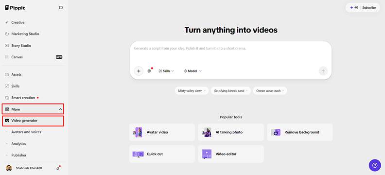
Step 1: Enter Your Text Styling Workspace
- Sign in to Pippit using Google or social media before styling your video text content.
- Open the “Video generator” from the left menu under the “More” tab now to begin.
Step 2: Generate Your Styled Video
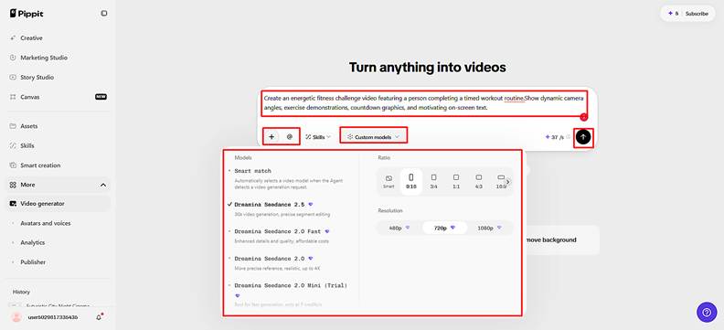
- Select Dreamina Seedance 2.5, Dreamina Seedance 2.0, or Dreamina Seedance 2.0 Fast.
- Choose Dreamina Seedance 2.0 Mini, Dreamina Seedance 1.0, or “Auto Route” for value.
- Enter a detailed prompt describing your video, text placement, visual style, and overall appearance clearly.
- Click “+” to upload reference images or videos from your device, phone, Dropbox, or a link.
- Select existing assets instead when suitable reference media is unavailable for your text styling projects.
- Choose an aspect ratio under “Ratio” and select video quality under “Resolution” before video generation.
- Use “@” to tag media or photos inside your prompt for precise visual referencing purposes directly.
- Confirm every setting, then click “Generate” to create your video before styling your text further.
Step 3: Refine Typography and Export
- Preview the generated video and adjust details.
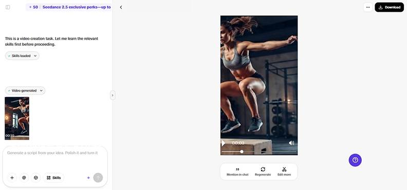
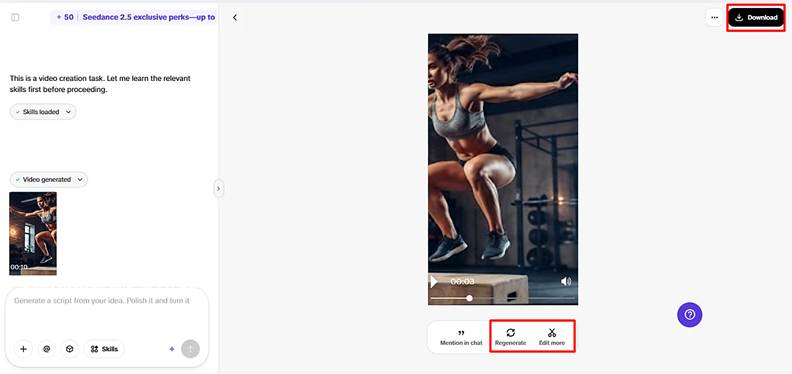
- Click “Regenerate” when results need further changes.
- Click “Edit more” to refine your video content using Pippit’s available AI editing tools further.
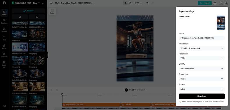
- Manually edit captions, add text, and adjust size, color, alignment, filters, and effects as needed.
- Add background music, remove backgrounds, and fine-tune visuals until text styling matches your intended design.
- Click “Download” to export the completed video with customized text styling to your device.
- Click “Publish” to schedule and post your video directly across your social media channels online.
Use Alignment and Position to Create a Cleaner Composition
The direction of the text is determined by alignment, and each of the options should correspond to the direction of the scene. Left alignment is effective when open space is on the left side of the subjects. Center alignment works well for short headlines, where the composition offers even space around the headline. Right alignment can be used to accentuate subjects that lean towards the other side. Avoid placing text over faces, product information, controls, or platform interface zones. Different shots can seem connected visually if they’re consistent in alignment from scene to scene. Spacing around text is important, too: Captions that are too close together are less readable. Mention that text can be moved around to make it easier to read, without altering the actual text.
Combine Size, Color, and Alignment Into a Text Hierarchy
The size, color, and alignment should be used as coordinated controls and not as single settings. A headline can set a priority using larger type, before more color emphasis is needed. Supporting copy can still be small and use moderated colors to hold attention. Captions need to be in the same position and size throughout scenes in the same sequence. Size, contrast, or placement can be used to emphasize a call to action. Size of text should carry alignment that supports the reading path. Taking all phrases to be equally important eliminates beneficial distinctions in information levels. There are fewer elements that compete when important words are in restraint.
Fine-Tune Captions, Effects, and Supporting Visual Elements
Manual caption adjustments can be used to fix timing, word choices, spacing, and placement, following caption generation. These changes are useful when the text generated by the scene isn’t in sync with the visual rhythm. Effects can be used to add emphasis – however, too much motion or too much glow can make it less readable. Background removal is useful when there are other elements that impede typography. The message should be reinforced by music and/or visual effects and not overwhelmed by text. Pippit offers editing features to tune the output after the initial version.
Preview Text Styling Before Export
A thorough preview can be used to find out what is wrong before the completed video is seen by the public. Look for any clipping, misplaced, small, overlapping, or hidden text in each scene. Test to make sure colors continue to stand out with varying light and dark backgrounds. Go over the hierarchy starting from the first frame to the last call to action. Ensure that captioning is legible at the desired viewing size. Repeat or adapt the appropriate creative elements in a composition when it does not work out. Double-check all names, prices, dates, product information, claims, and call-to-action before exporting.
Conclusion
Typography has a direct impact on comprehension, emphasis, pacing, and visual polish. Pippit bridges the AI video creation and practical customization of captions and other textual components. Size creates priority, and color provides contrast and brand continuity. Alignment is the way in which the viewer navigates their reading path in each scene. Important information is presented without being overpowered by the use of thoughtful hierarchy. Post-editing after generation provides more control to the creator in terms of video communication.
Follow the rest of the Top Experiences series
- TOP TWENTY THINGS TO DO IN EGYPT
- WHY YOU SHOULD VISIT MALTA
- TOP FUN THINGS TO DO IN HAMPI
- 10 HISTORICAL PLACES TO ROAM ACROSS THE WORLD
- 10 HISTORICAL MARVELS OF ITALY
- 10 BEST SHOWS IN EUROPE YOU MUST SEE
- DUBAI THRILLS: 7 MUST-DO ACTIVITIES
- 10 HISTORICAL MARVELS IN TURKEY TO ENJOY WITH KIDS
- MOST ENCHANTING PALACES IN EUROPE
- IN‑BETWEEN MOMENTS IN ASPEN
RESPONSIBLE TRAVELING-BECAUSE I CARE